1A
1B
2
3
4
5
6
7
8A
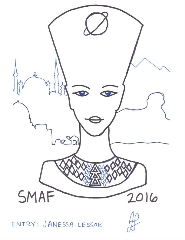
8B
9
10
11A

11B

11C
11D

11E

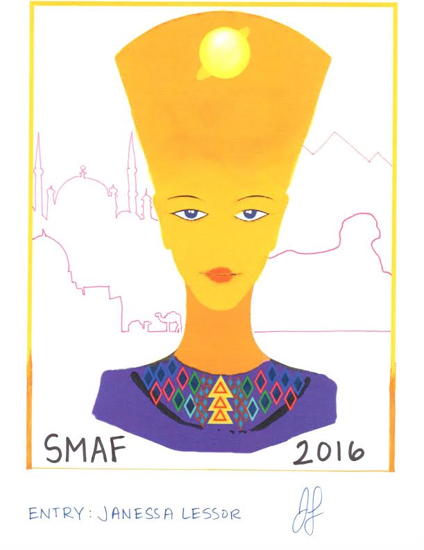
1A
1B
2
3
4
5
6
7
8A
8B
9
10
11A
11B
11C
11D
11E
If you know how to use Photoshop, you have power to manipulate reality and trick the viewer. This power is often used by advertizers. They “retouch” photos of people to make them look more “beautiful”. Skin can be smoothed, proportions changed, eyes sparkled, etc. Here are some examples of photos before and after they were retouched. Can you see the differences?
![Article348238_JessicaAlba_photoshop[1]](http://graphicdesign2013.blogs.kpbsd.k12.ak.us/wpmu/files/2013/03/Article348238_JessicaAlba_photoshop1.jpg)
![celebrities-before-and-after-photoshop-18[1]](http://graphicdesign2013.blogs.kpbsd.k12.ak.us/wpmu/files/2013/03/celebrities-before-and-after-photoshop-181.jpg)
![faith_sides_lg-(2)[1]](http://graphicdesign2013.blogs.kpbsd.k12.ak.us/wpmu/files/2013/03/faith_sides_lg-21.jpg)
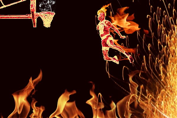
Changing people using Photoshop is often criticized for giving the public unreal expectations of what they need to look like in order to be beautiful. In reality, its unatainable because its not real, just computer manipulation. We are going to make our own retouched piece and you can chose if you want to make a book cover, magazine cover, album cover, movie poster, or advertisement. Here are some examples:
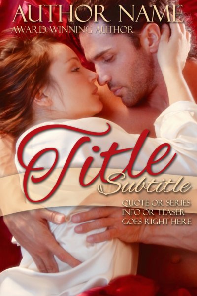
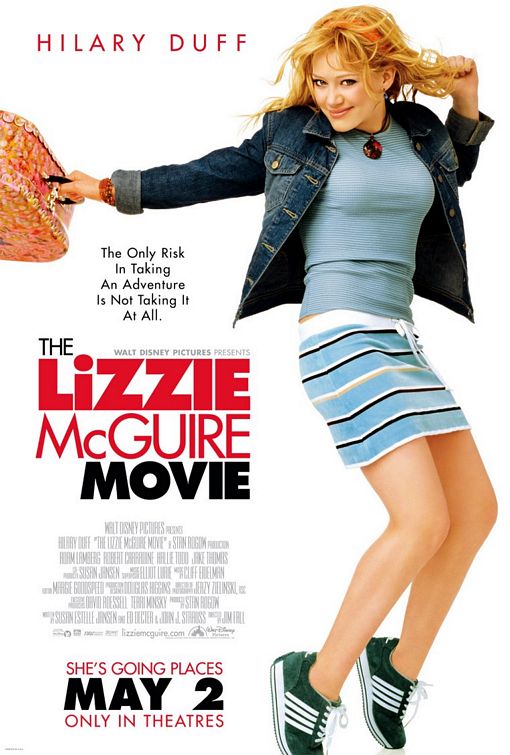
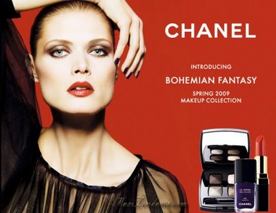
I’m going to make a Movie Poster
1. Smooth your skin. Once you have your photo open, Duplicate the background layer and name it skin. On the skin layer, go to Filter -> Noise -> Median…and enter a value of around 3 pixels. Then go to Filter -> Blur -> Gaussian Blur… and enter 5 pixels.
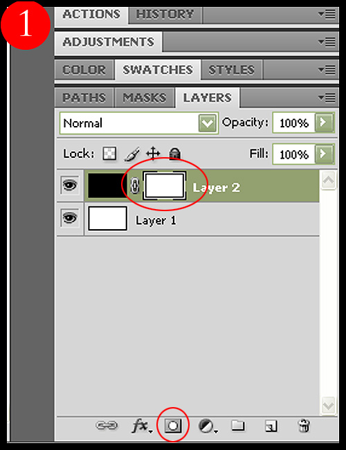
Step 2. Add a layer mask (by pressing the first button on the lower part of the Layers Palette) to the layer you have just blurred and fill it with black. Then pick a soft, medium sized brush and start painting with white on the layer mask. Make sure you avoid any lines on the face; use it only on the skin, to get a smooth, professional effect. Vary the brush size and opacity depending on the area. Avoid blurring the eyes, lips or hair.
After you finish this step, you should get something like this: 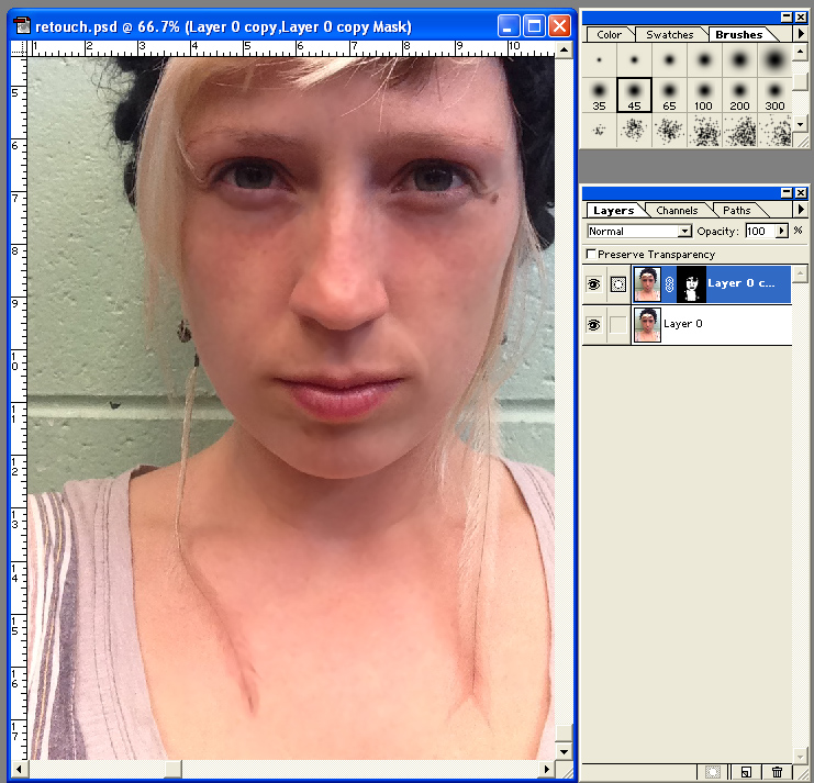
Step 3: Make the eyes pop
Duplicate the background layer and rename it Eye Pop. Make sure the Eye Pop layer is above the background layer. Select the dodge tool and lighten the iris. 
Stay away for the thin, darker, perimeter of the iris and the pupil. Use a fuzzy brush.
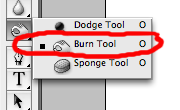
Select the burn tool and darken the perimeter of the iris and the pupil.
 You may also decide to slightly extend the eyelashes by changing your brush size to roughly 5px and running the burn tool along the length of the lashes. I rarely do this, but it can add a more dramatic pop for fashion pics.

* Note – I dodged my eyes a lot to make them look scary and glowing. You don’t have to make your eyes “pop” as much as I did.
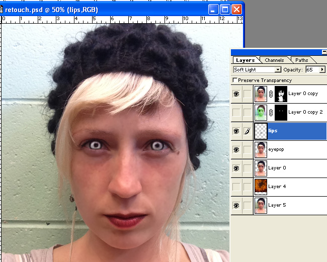
4. Make the Lips more Luscious. Make a blank layer above the Eye Pop layer and name it lips. Using a brush, paint over your lips as perfectly as you can using black. You might want to feather the edges so its not an overly crisp line there. 
On the layers tool bar where it says Normal change it to Soft Light. Adjust the opacity of that layer until it looks good to you.
5. Put in a background and make the figure match it. Flatten what you have so far if you are happy with it. If you want, use the clone tool to smooth out or remove any additional blemishes or loose hairs at this time. Cut your figure out as neatly as you can! Use the lasso tools, magnetic wand, eraser. Remember, selctions can be altered with Shift (+) and Alt (-). Select a background that makes sense and looks good. Go to Image->Adjust->Channel Mixer and mess with the dails till the colors in your skin seem to look good with the background.
6. Make it look like a real book cover, magazine cover, album cover, movie poster, or advertisement I added a black frame around mine, then used a mask to have the bottom of my photo fade to black. Look at the examples above to determine what sort of text should be on your project. I recommend using Photoshop elements for the text part because it has more options and samples. Good luck and have fun!
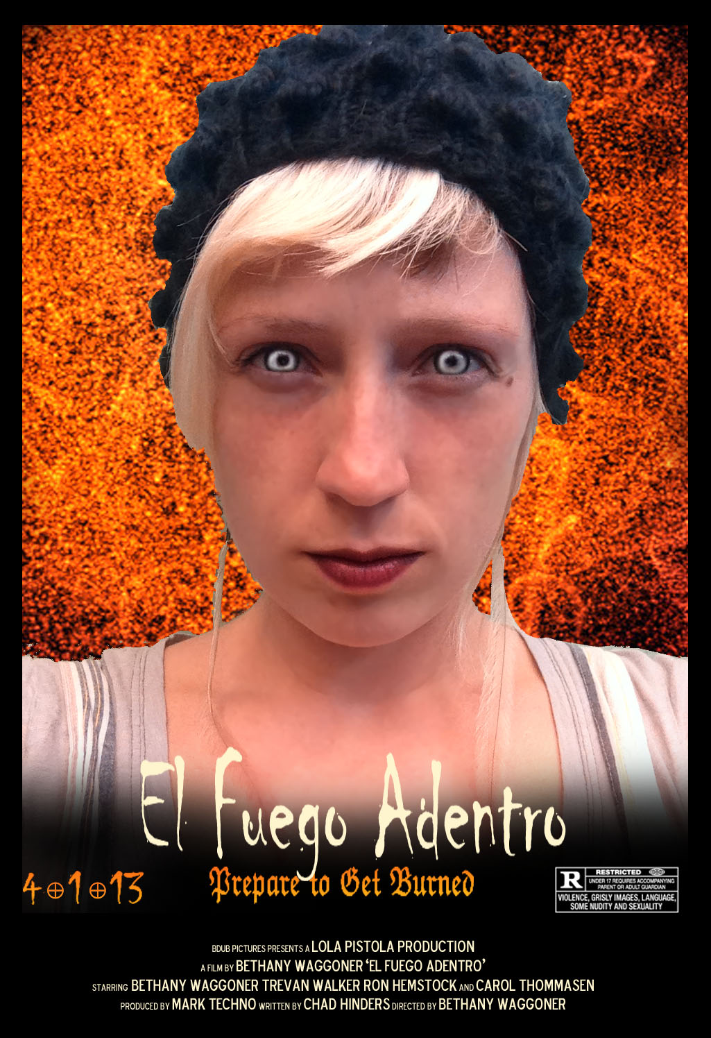
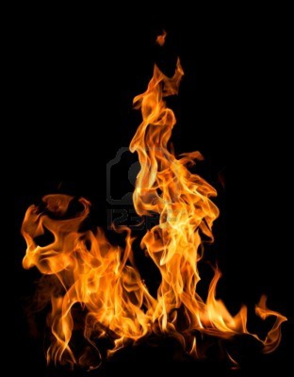
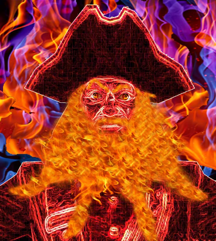
For our next project we will make a person or object appear to be on fire and shooting flames or in some sort of fiery environment that makes sense for that object/person.
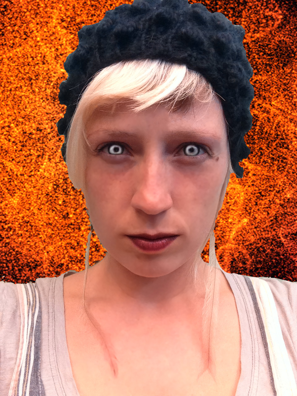
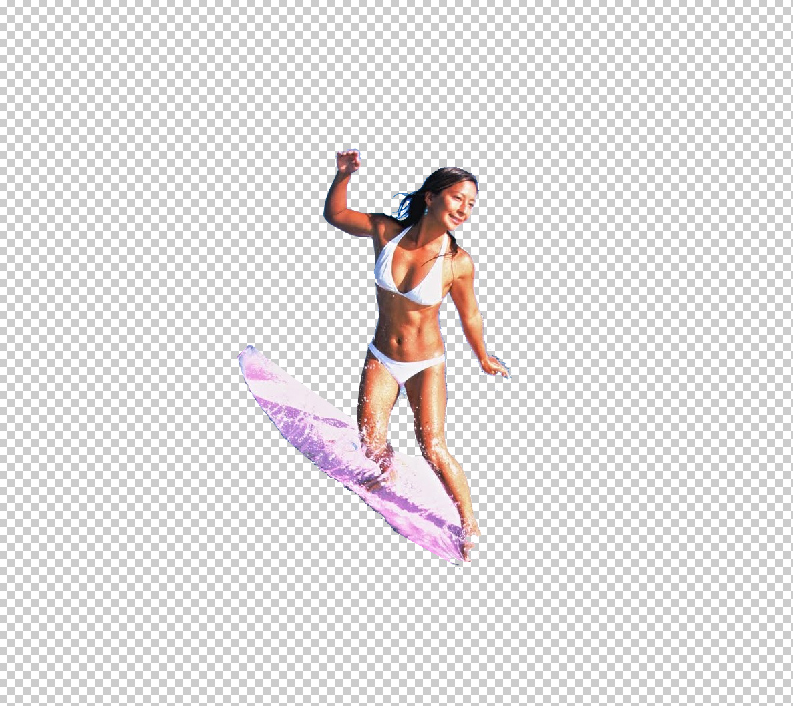
Here is my surfer girl, riding a lava wave with flame times, shooting sparks!
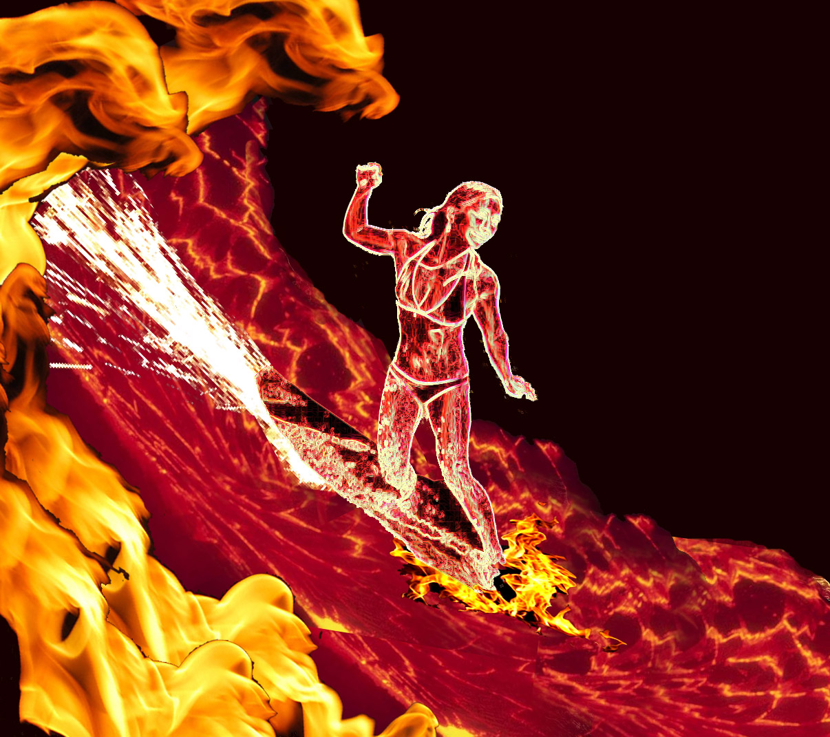
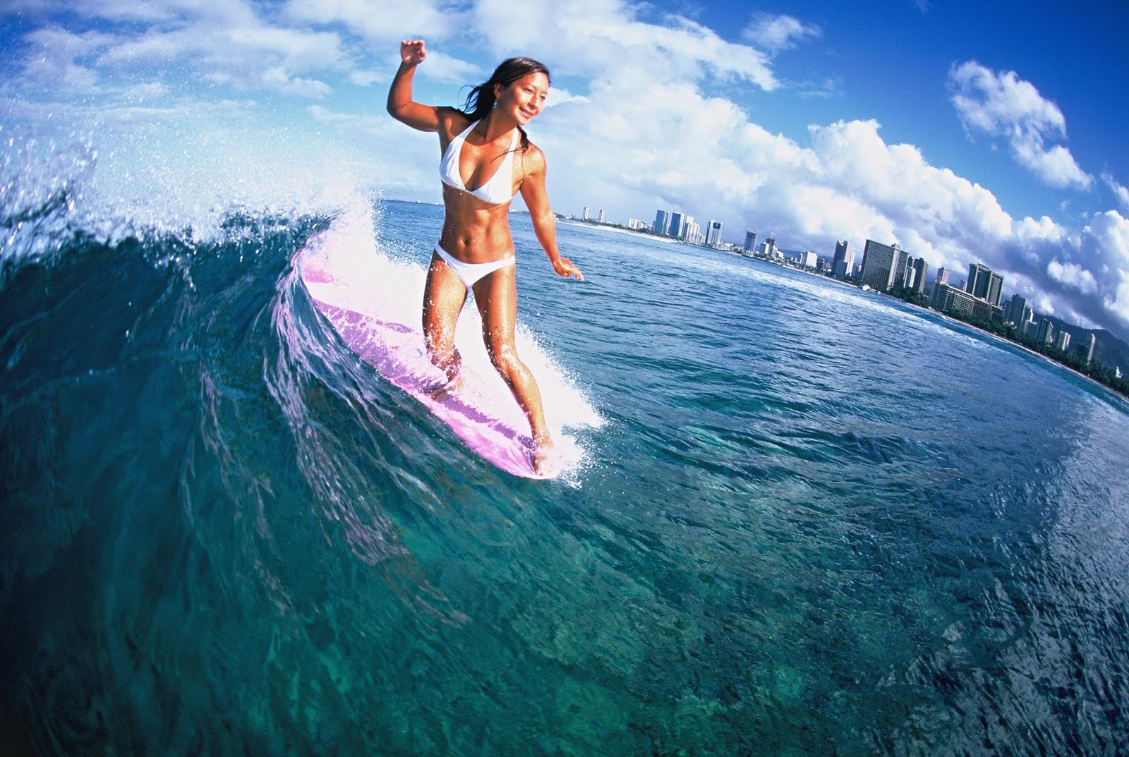
This was the original photo:
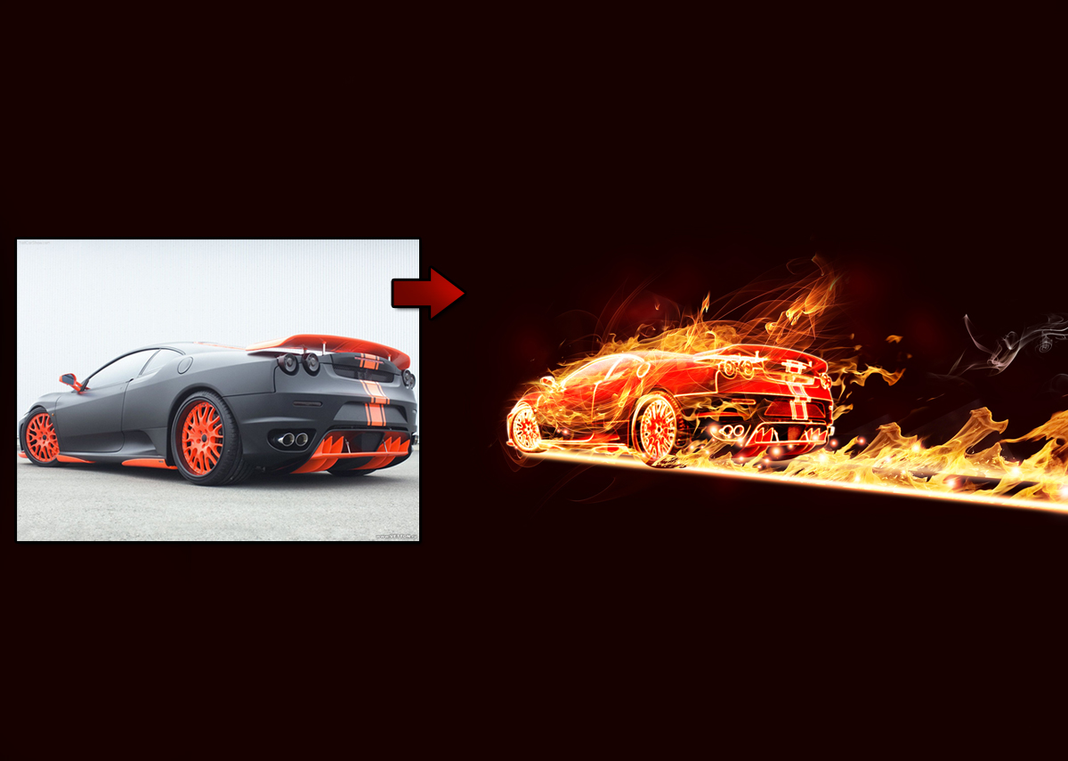
I got the idea from this online tutorial, which transormed this car:
Step 1: Decide on your object/person and cut it out neatly!
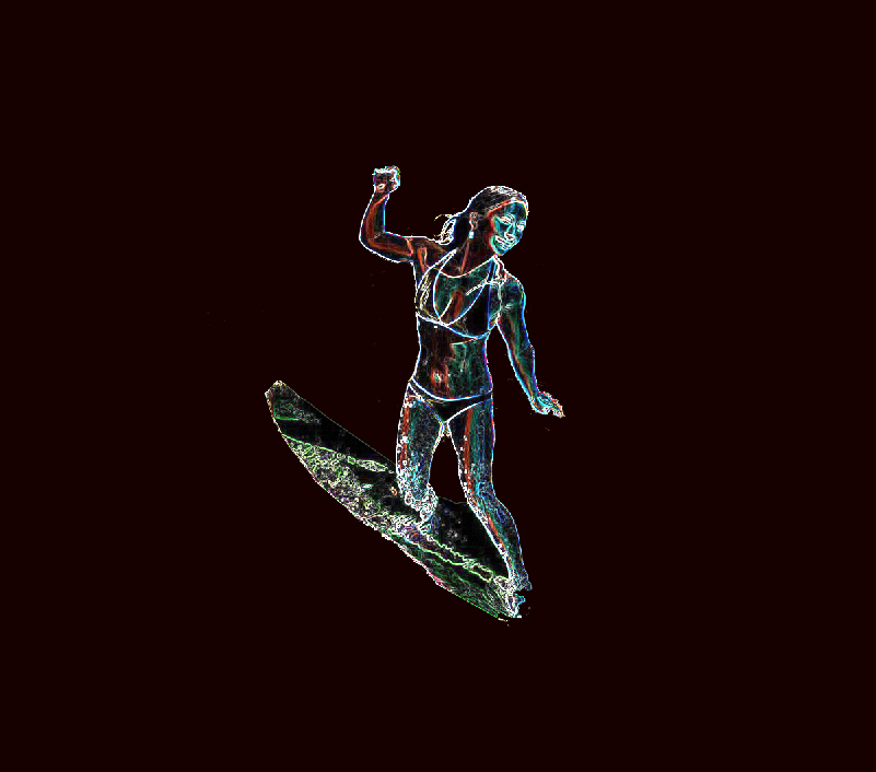
Step 2: Duplicate this layer about 3 times. Make it so you can only see the top one. Name it Outer Glow.
Step 3: Make a black background with a tint of red.
Step 4: On the Outer Glow Layer click Filter->Stylize->Find Edges. Then type Ctrl I to Invert the layer. It should look something like this.
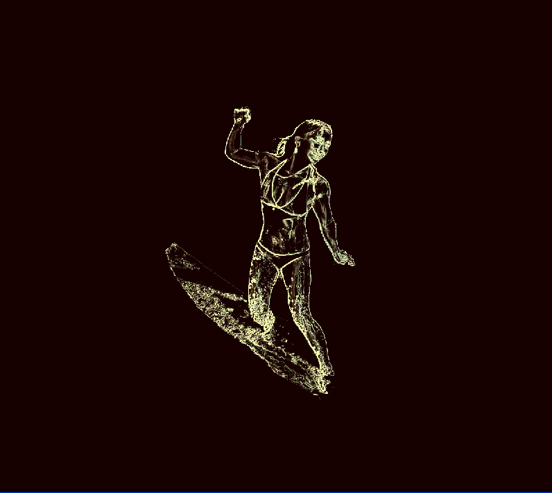
Step 5: Duplicate this layer. Make it so you can only see the top layer, titled Outer Glow. Name the copy underneath Red Channel. Click Select->Color Range with a very high tolerance (about 200) and click on the whitish outlines of the image. Click Select->Inverse and delete evertything but that whitish outline. Next hold Control and click on the little picture to the left of the layer in the layer window. All the ouline should be selected. Make the Foreground color a whitish yellow. Click Edit-> Fill->Foreground Color. Your image should look like this:
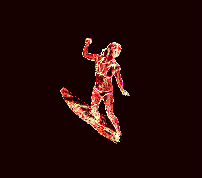
Step 6: Click the eyeball on the Outer Glow layer so you can’t see it and make it so you can see the Red Channel layer. On the Red Channel layer click Image->Adjust->Channel Mixer. Make sure the Output Channel says Red. Slide the tabs of the Red, Green, and Blue Channels all the way to the right so your image looks really red. Next click on the eyeball of the Outer Glow layer so its on top of the Red Channel Layer. It should look something like this:
Step 7: Create the environment. At this point, it is your job as a graphic designer to make a fitting scene for your object/person. I combined these pictures to make my background:
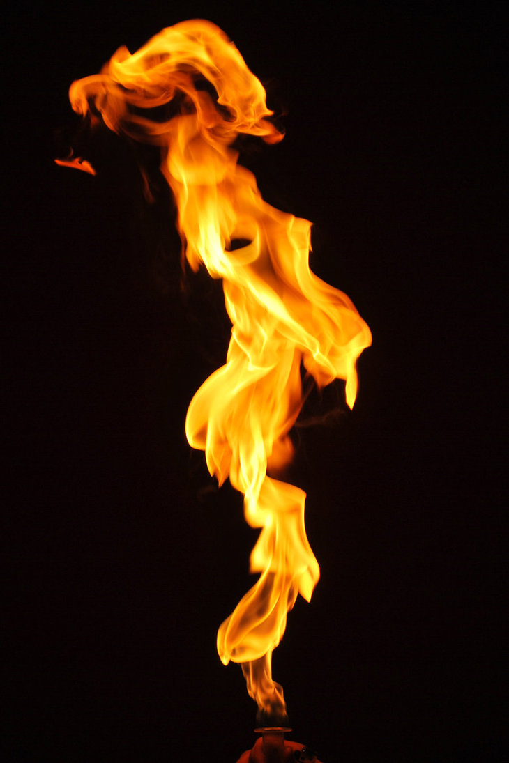
I cut out and then skewed this flame to make curl like the top of the wave. I also duplicated it 3 times.
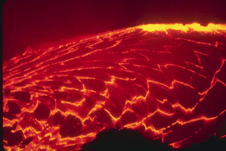
I flipped this lava picture and duplicated it, and used the Clone Tool to smooth the seams.

I used these sparks as a trail behind her.
I warped this flame to put in front of the board.
Please put as much time and thought into your environment too! Have fun, make something that looks cool!
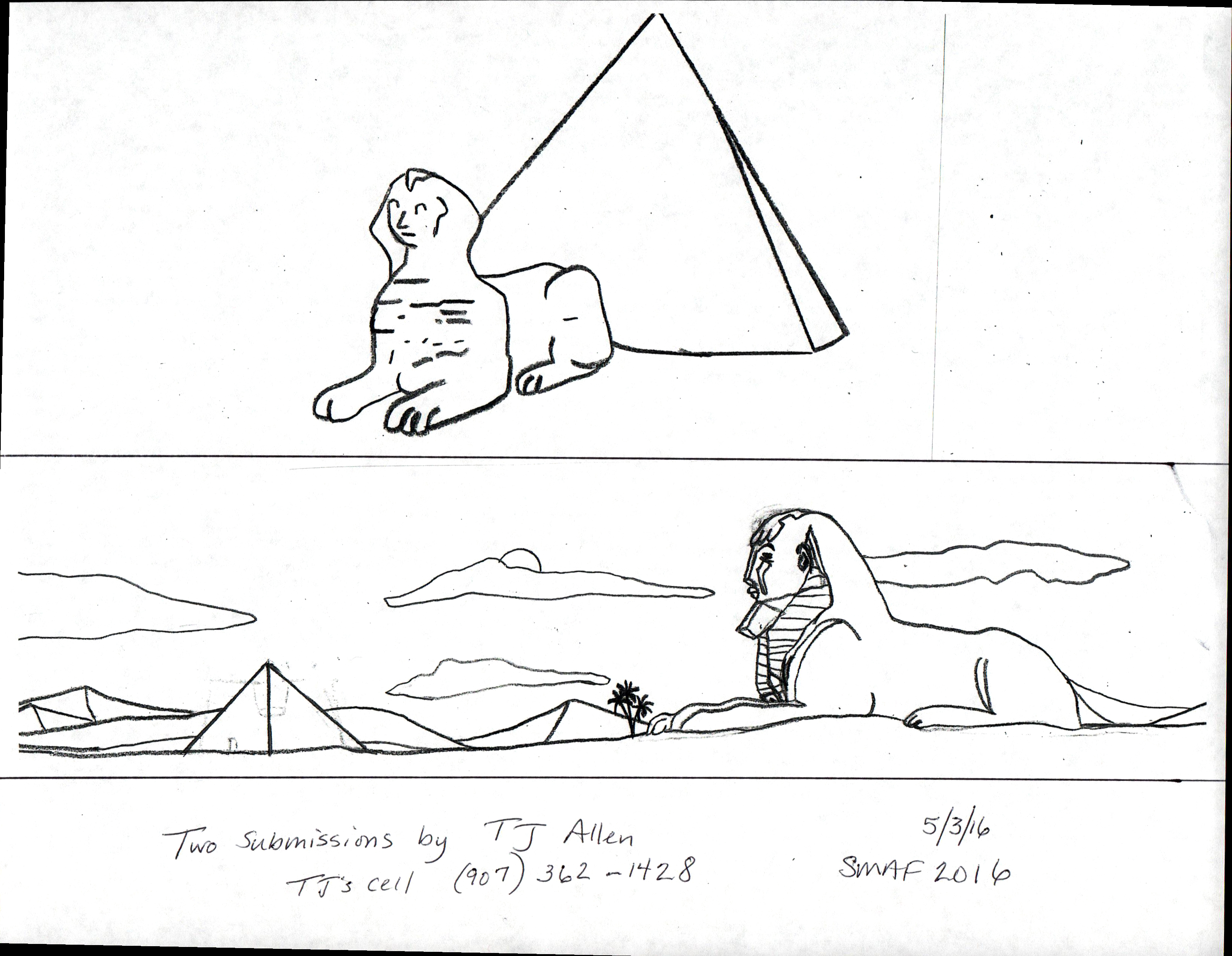
Jack Broughton
TJ Allen
New Call for Art from the Community! $200 Prize, Fame, Glory: The chosen design may be reproduced on t-shirts, sweatshirts, hats, pins, and/or poster.
DESIGN THE LOGO FOR:
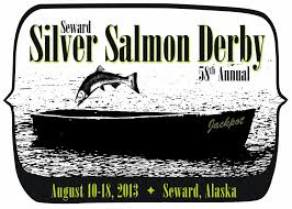
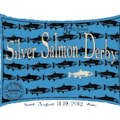
2014 Seward Silver Salmon Derby
Their Rules:
The design must include:
Design must fit on 8 1/2 x 11 inch paper and have four color maximum.
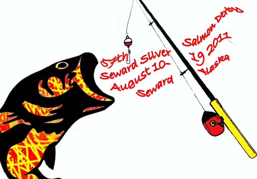
My Thoughts: Be creative and think outside of the box! Here are the last 4 years designs:
2103
2012
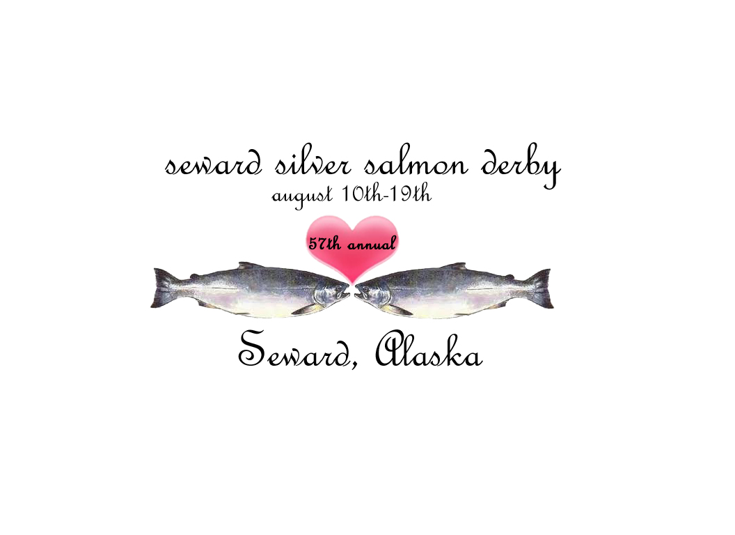
2011
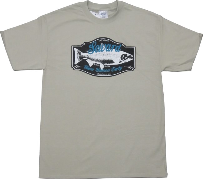
2010
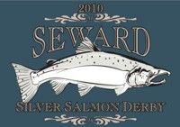
2010
2011 and 2010 look almost the same! How could you create a silver salmon in a different way, different angle, etc? Apply the skills you learned when working on other projects. Good luck and make something cool…win that money!
Here are some designs from students last year:
Audra Atwood
![]()
Gabe Esposito
Kiana Clemens
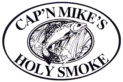
Two locals are starting their very own Smoked Fish Business called Saltwood Smokehouse and would like a logo!
Theme ideas:
Rapture of the Deep, Briner 49er, and My Grandchildren Eat This Fish
round or oval logo
4 colors, preferably colors of the sea
Here are some other fishy businesses….

![]()
![]()
![]()
![]()
![]()
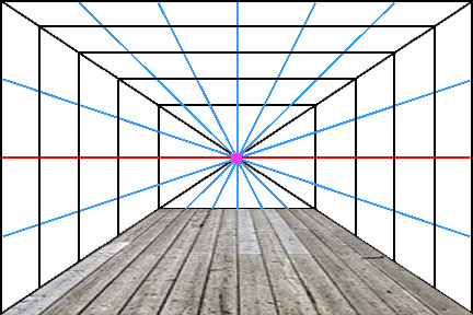
Perspective is an approximate representation on a flat surface of an image as it is seen by the eye. Objects appear to grow smaller as they get further away. Here is an example:
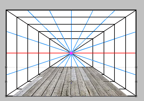
The different parts of one point persepctive:
Horizon Line is the eye level of the observer vertically.
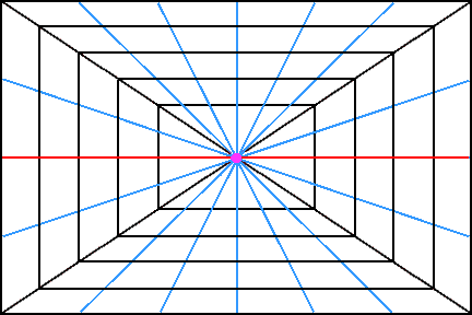
In this graphic, the horizon line is represented in red.
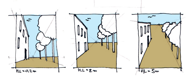
In this illustration, the horizon line is where the blue sky meets the brown street.
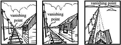
Perhaps in the left hand drawing the viewer is sitting on the sidewalk, so the horizon line is low. In the right hand drawing the viewer is standing on the roof of a building, therefor the horizon line is higher.
The Vanishing Point is a point at which receding parallel lines seem to meet when represented in linear perspective .
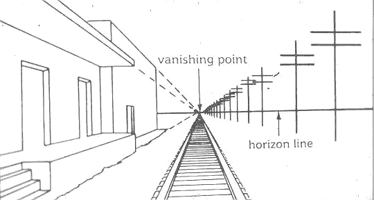
The Vanishing Point rests on the horizon line and it represents where the viewer is situated from left to right.
In the central panel of this illustration of a railroad, the viewer is to the left of the tracks, therefore the vanishing point is on the left side of the horizon line.
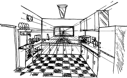
An interior scene also has a horizon line and vanishing point. Can you find them in this drawing?
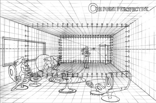
Your assignment is to create an interior scene which follows linear perspective.
Your scene must have:
A floor
A ceiling
walls
at least one object on each wall which follows perspective
(window, book case, door…)
at least one figure, standing, jumping, or floating which looks convincing in the scene.
Have fun!
Here is my example:
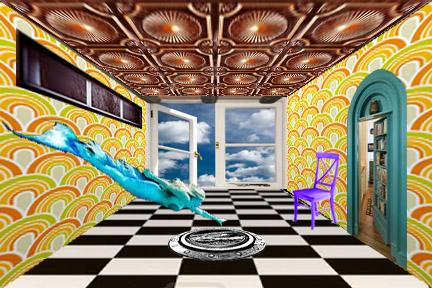
Begin with a grid or a photo that you can use as a guide for your perspective lines and wall shapes. I used this one:

Here is how I made a hardwood floor follow perspective.
1. I found a picture that already had some perspective lines and added it as a new layer onto my grid
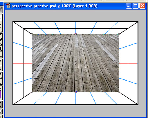
2. Using the polygonal lasso tool , isolate the corners of the hard wood floor.
3. Delete both corners
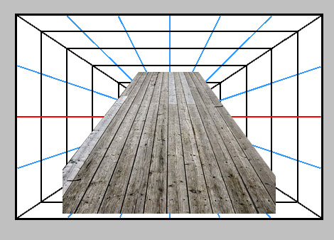
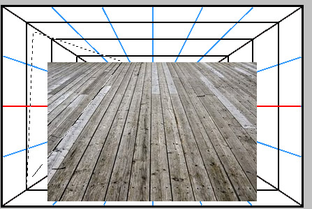
4. Line up the top of the floor with the bottom of the back wall
5. Using Edit–>Transform–>Perspective or Edit–>Transform–>Skew to make the floor fit perfectly.
6. Repeat this process or a similar one for the walls, ceiling, and objects along these planes.
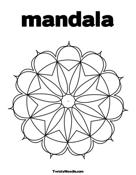
What is a mandala?
A mandala is a geometric pattern or chart, typically circular or square, that symbolically represents the cosmos and is used for meditation purposes. The mandala originated in the Hindu religion, in which it was first used as a design element in temples, and was borrowed into Buddhism. Other religions and cultures have analogous meditation aids, and in an expanded sense, a mandala may even be a round, symmetrical building used for worship.
Creating a mandala can be a form of meditation, as well as contemplating a finished mandala. In Tibetan Buddhism, there are strict guidelines concerning the content and design of a mandala, including the visualization of the piece and mantras to be recited as it is made. Different types of mandalas are used to represent different elements of Buddhist beliefs and cosmology, but they are generally full of symbolism and richly detailed.
Tibetan Buddhists also make sand mandalas, using delicate tools and colored sand to create intricate designs. After they are made and contemplated according to ceremony, sand mandalas are destroyed, symbolizing the impermanence of everything. Every element of the sand mandala, from marking out the pattern, to pouring the sand, to disposing of the used sand, is ritualized. Mandalas also appear in Japanese Buddhist temples and rituals, although the sand mandala is unique to Tibetan Vajrayana or Tantric Buddhism. Meditation or prayer aids in other religious traditions, such as the rosary of Catholicism, are considered by some to be a type of mandala. (from WiseGEEK.com)
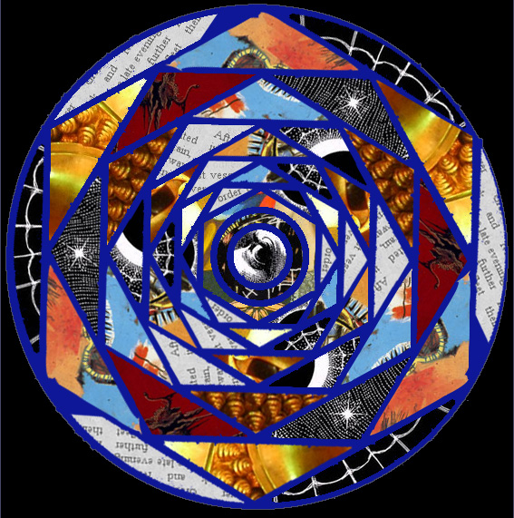
We are going to make our own mandalas using photos.
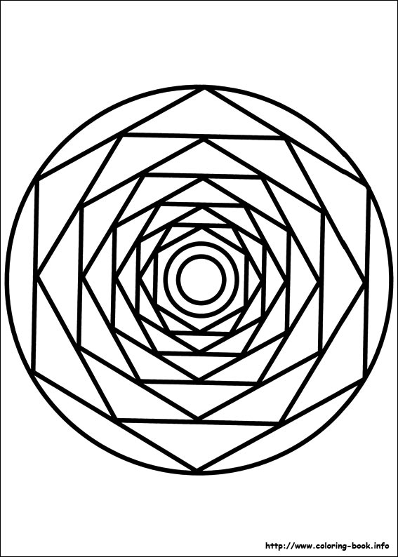
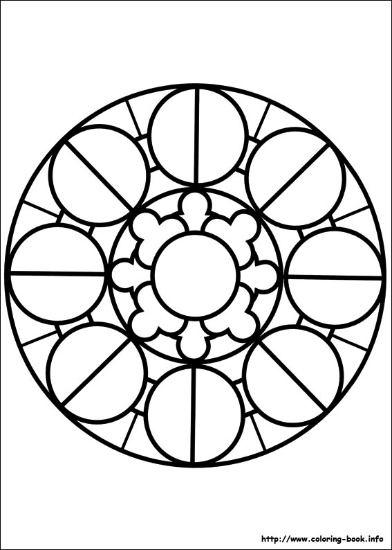
1. Choose a mandala template.


2. Open the template in Photoshop and delete the white so that it’s transparent other than the black lines.
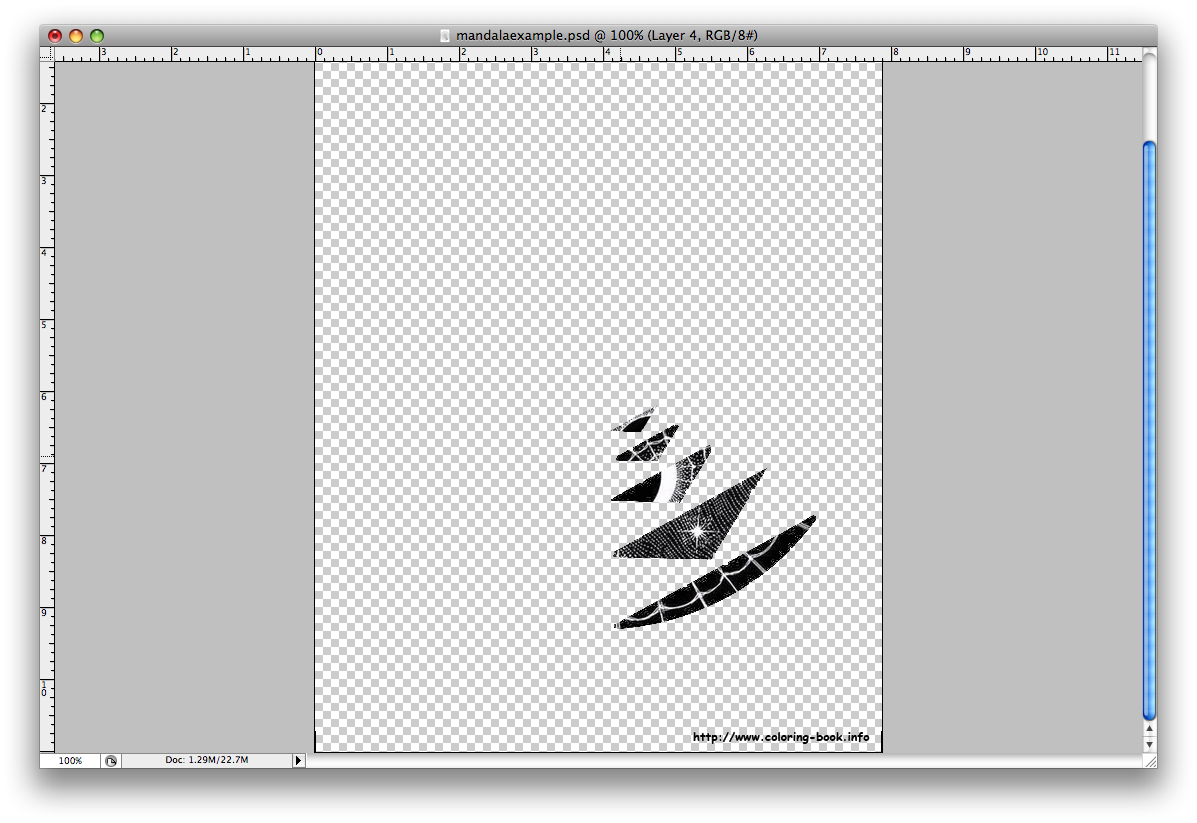
3. Add your first photo as another layer and put it behind the mandala template. Choose your photos based on texture and color.
4. Pick one shape within the mandala template to focus on. Move the photo layer until you like the section which is behind your mandala shape. You can rotate it or adjust the scale if you’d like.
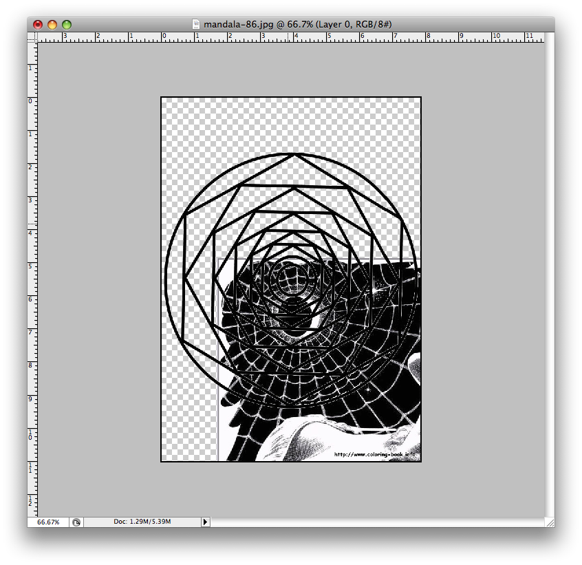
5. On the mandala template layer, use the magic wand tool to select inside the shape. Click Inverse Selection. Go to the photo layer and press delete. You should now have just a portion of the photo inside the mandala shape, like the photo below.

6. Continue this process until you have a vertical row filled.
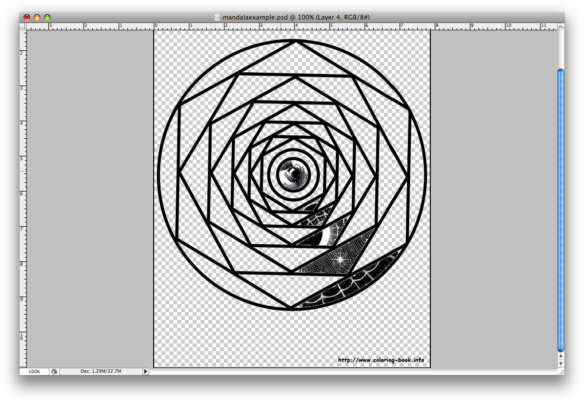
7. Unclick the eyeballs on all of the layers except the new shape layers you have made. Click Layers->Merge Visible. Now all of your shapes are on one layer.
8. Duplicate this layer and rotate it to fit other sections in a pattern.
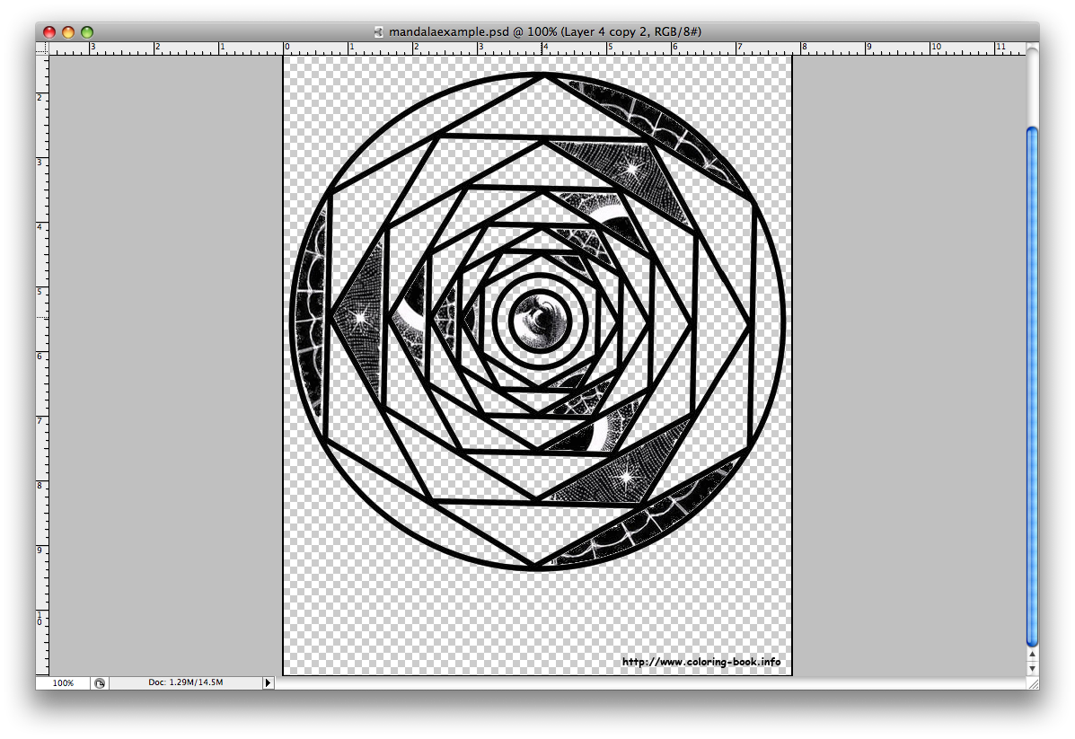
9. Continue with this process until the whole mandala is filled! My only rule is that shapes from the same photo should not touch. If you want, at the end, get rid of the mandala template layer and add a new background color. Have fun, be creative and make something that looks cool!
10. When you are done, post it to your blog under Project 9:Mandala, and write about how the project went, if you learned anything,etc.
Here are some past examples from SHS students:
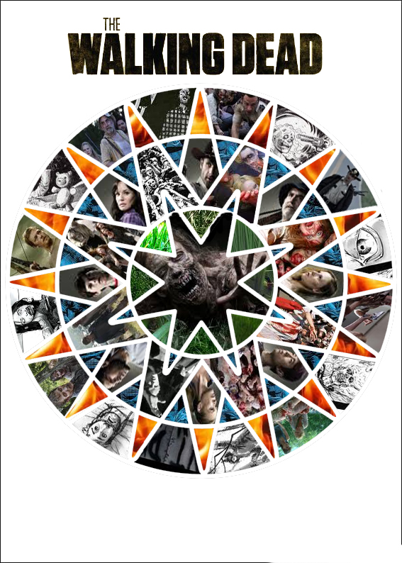
Audra Atwood
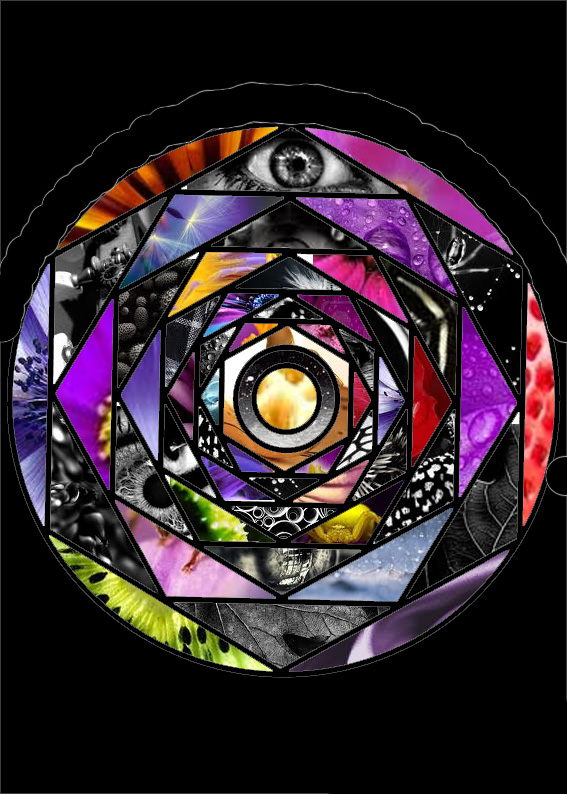
Michael Marshall
Seward’s PTA group (Parent Teacher Alliance) needs a new letterhead because they have changed their name! They used to be called the PTSA (Parent Teacher Student Alliance) but my guess is they have axed the student portion 🙂 So, what they need is the offical PTA logo (below) with Seward added on top. You pick the font/color, make it look professional and nice! Easy Peasy…
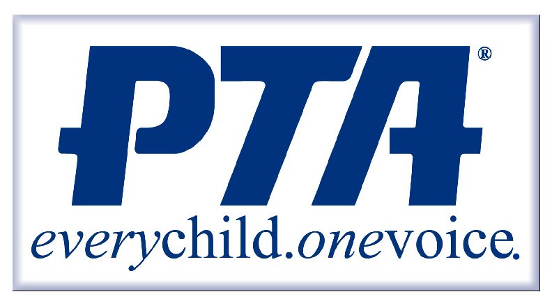
Old logo: PTSA letterhead
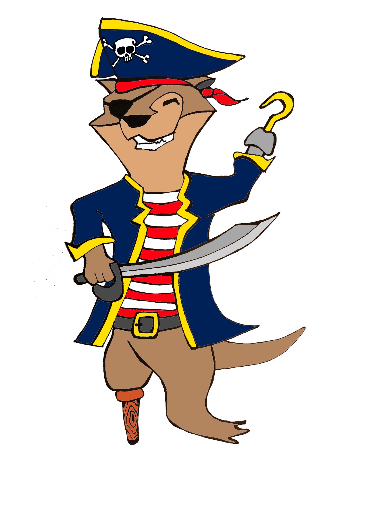
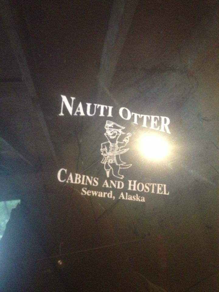
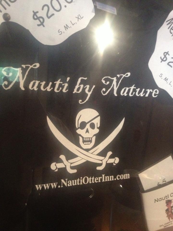
The owner of the Nauti Otter Inn here in Seward wants a new design for her T-shirts. She is offering $50 to a design she choses and a free Hoody! Check out her website with the link above! Here is Mr. Nauti Otter, the logo:
The Owner wants a new design for her Tshirt (front and back) with an action scene such as on a pirate ship, driving a boat, etc
When brainstorming ideas keep in mind her business is based out of Seward so you could put local iconogarphy- Reserurection Bay, Mt Alice, Mt Marathon, Fox Island…
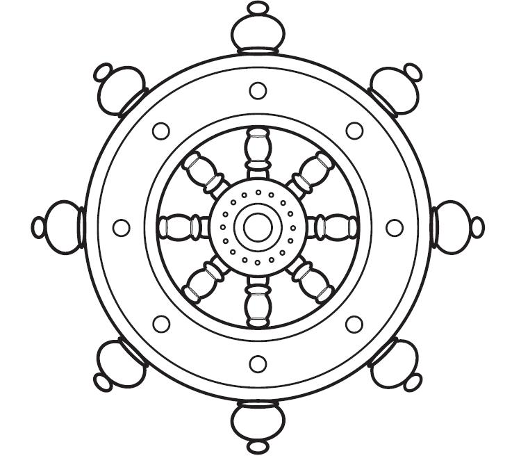
I reccoment you find Royalty Free Clip Art Images of whatever your idea is, I reccomend:
Ship’s Wheel, Pirate ship, Seward Scene, BLING (diamonds, gold coins, etc), Res Bay Map, Stylized Ocean Waves, Swords etc…
You will turn in 2 images, one for the front, one for the back
Include:
Nauti Otter Cabins and Hostel,
Seward Alaska
www.NautiOtterInn.com
nautical or pirate themed
Have fun and be thoughtful about which parts you feel should be in the front and which parts should be in the back!
Another local business is looking for a new logo!
$100 payment if the owner chooses one of your designs!
1. Open to a NEW name
Pet Lodge
tag line ” What aBARK! The dog?”
Pet boarding/daycare/walking
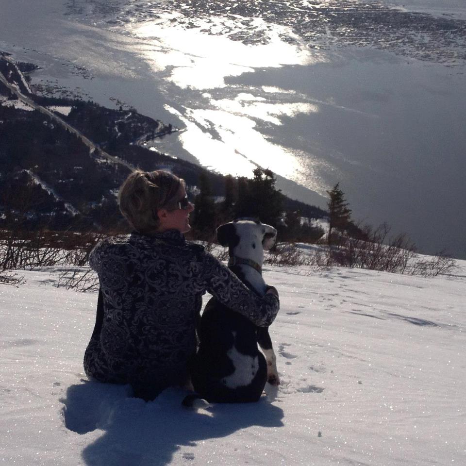
The owner is looking for something professional but a little cute. She would like to use Otis, her dog, as a logo. She wants to show adventure.
3/4 Colors
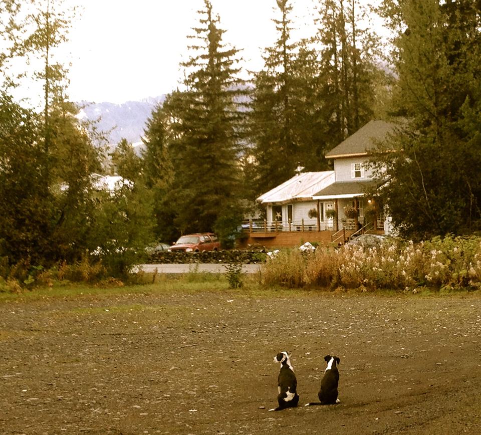
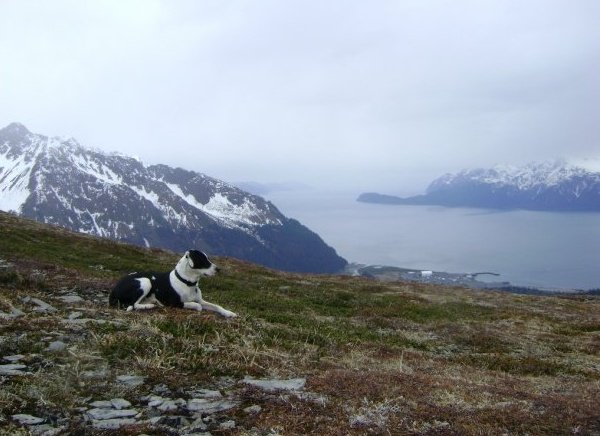
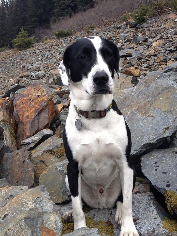
Here is Otis!
Suggestions:
Trace over one of her photos of otis to make it more graphic like
Cut Otis out and use the Posterize or Threshold adjustment to simplify him to 2-3 colors
Find a royalty free coloring book dog image and stylize it to look like Otis
Hand Draw a cartoon Otis using my new tablet!
Draw Otis using circles and straight lines like I did!
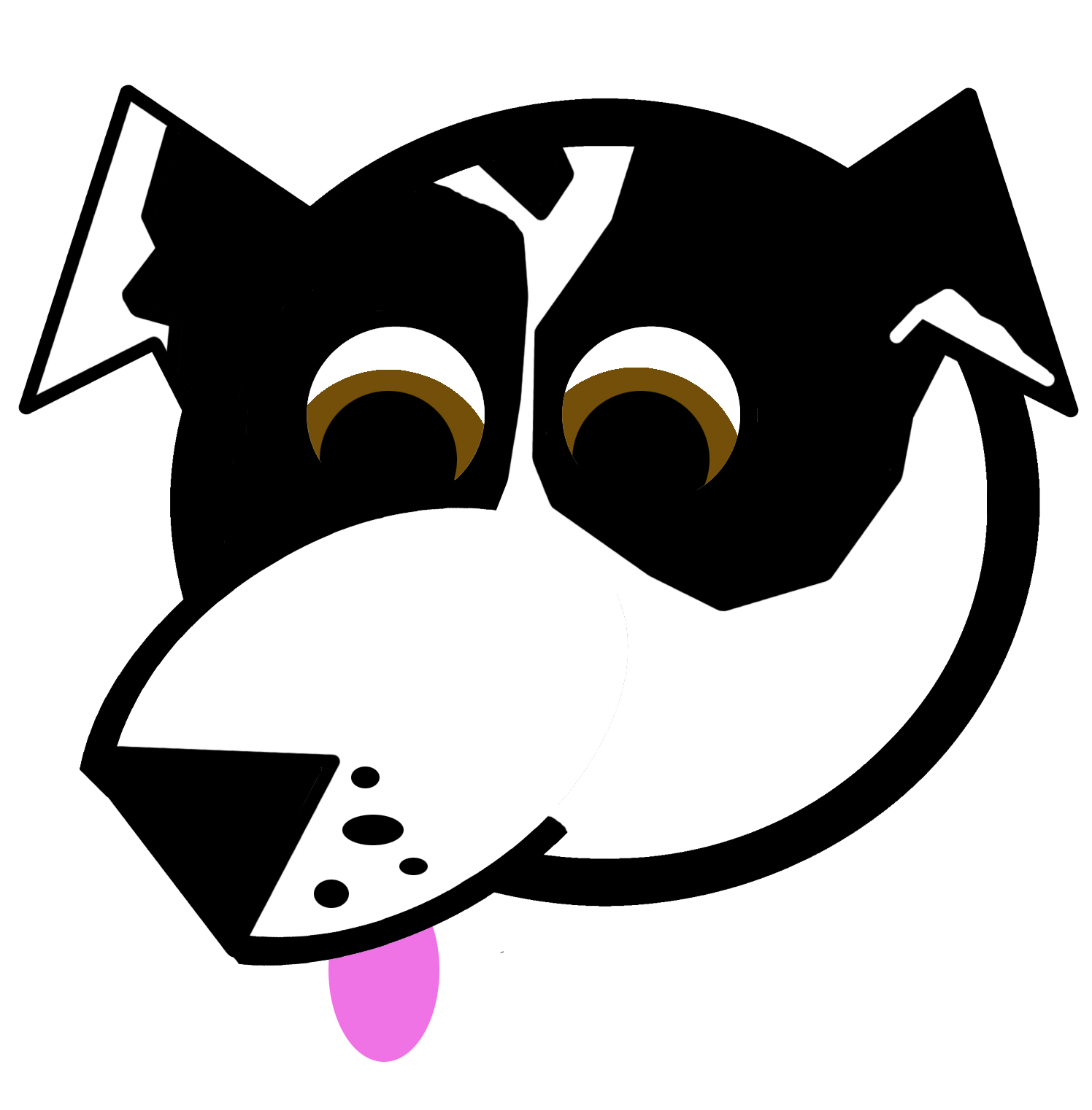
My Cartoon Otis 🙂

![]()
![]()

![]()